Cell therapy instrument software
Instrument control UI
- Role
- Lead Product Designer, Instrument UI
- Duration
- Multi-phase engagement
- Product
- Desktop instrument control software
- Focus
- Usability in regulated environments, UI consistency, cognitive load reduction
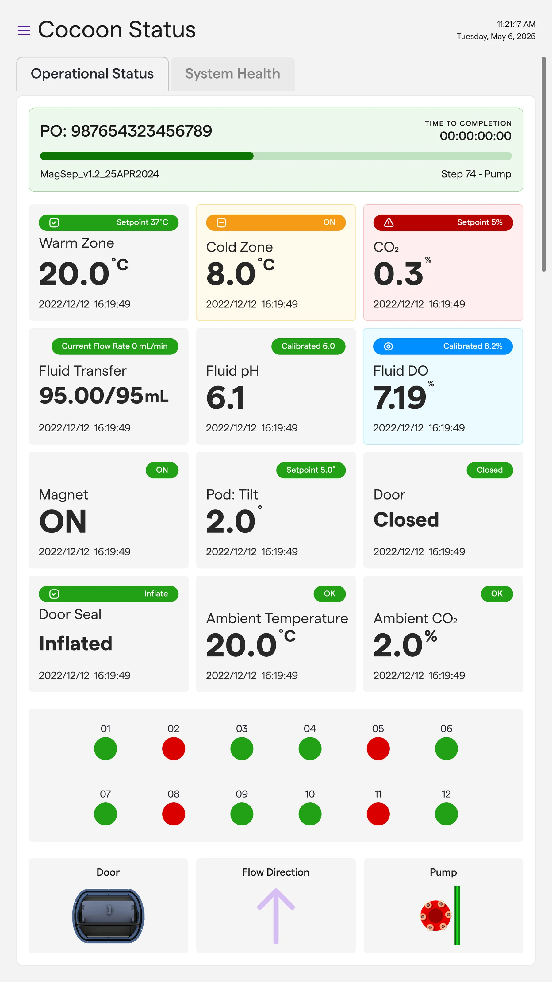
Overview
This project improved the interface of a fully automated, closed-system instrument used in cell and gene therapy manufacturing. The system runs highly customized protocols under strict regulatory, safety and reliability requirements.
At Strata, I designed the improved control interface that operators use during live manufacturing runs. The goals were a modern UI, clearer screens during critical steps, and the same look and behaviour as the rest of the client's software.
Problem
The platform was technically solid, but the instrument UI showed years of small additions:
- Related software tools looked and behaved differently
- Dense screens with little hierarchy
- System state and operator intent were not always clear
- More to think about than necessary during long or complex runs
Because the environment is regulated, changes had to be incremental, defensible and consistent with how operators already understood the system.
Key decision
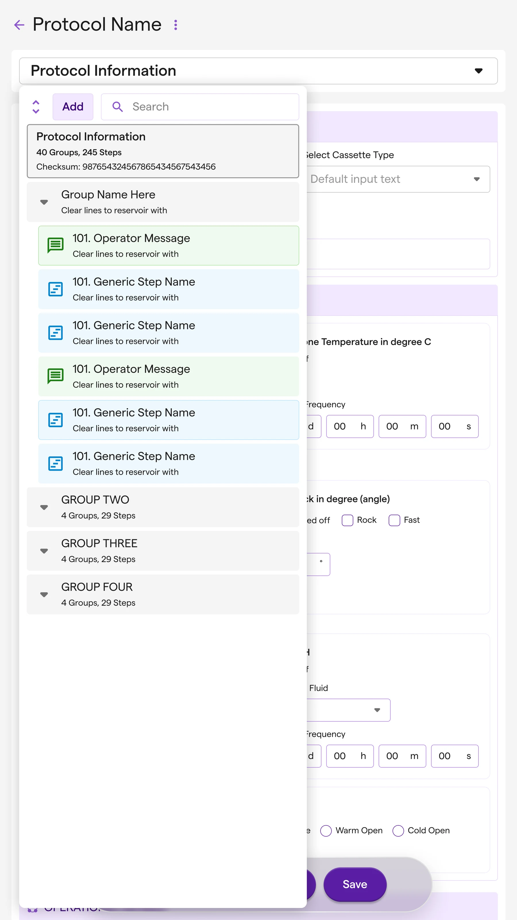
I changed how the screens read, not what operators do.
The workflows on live instruments were already validated, so I left them alone. The work went into hierarchy and feedback: standard layouts and components, a clear difference between configuring, running and monitoring, and alerts and confirmations that are harder to misread.
Approach
The work was about clarity, restraint and consistency. I did not introduce new workflows. The principles:
- Respect the validated workflows already running on live instruments
- Cut the noise at critical moments
- Standardize patterns across the software ecosystem
- Balance customization with predictability
I made design decisions together with product and engineering, with regulatory and technical constraints in view the whole time.
Solution
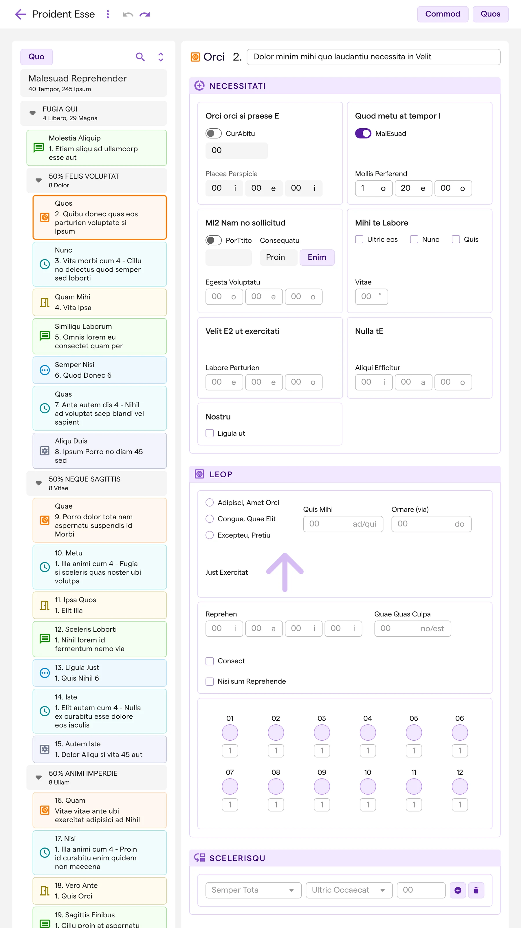
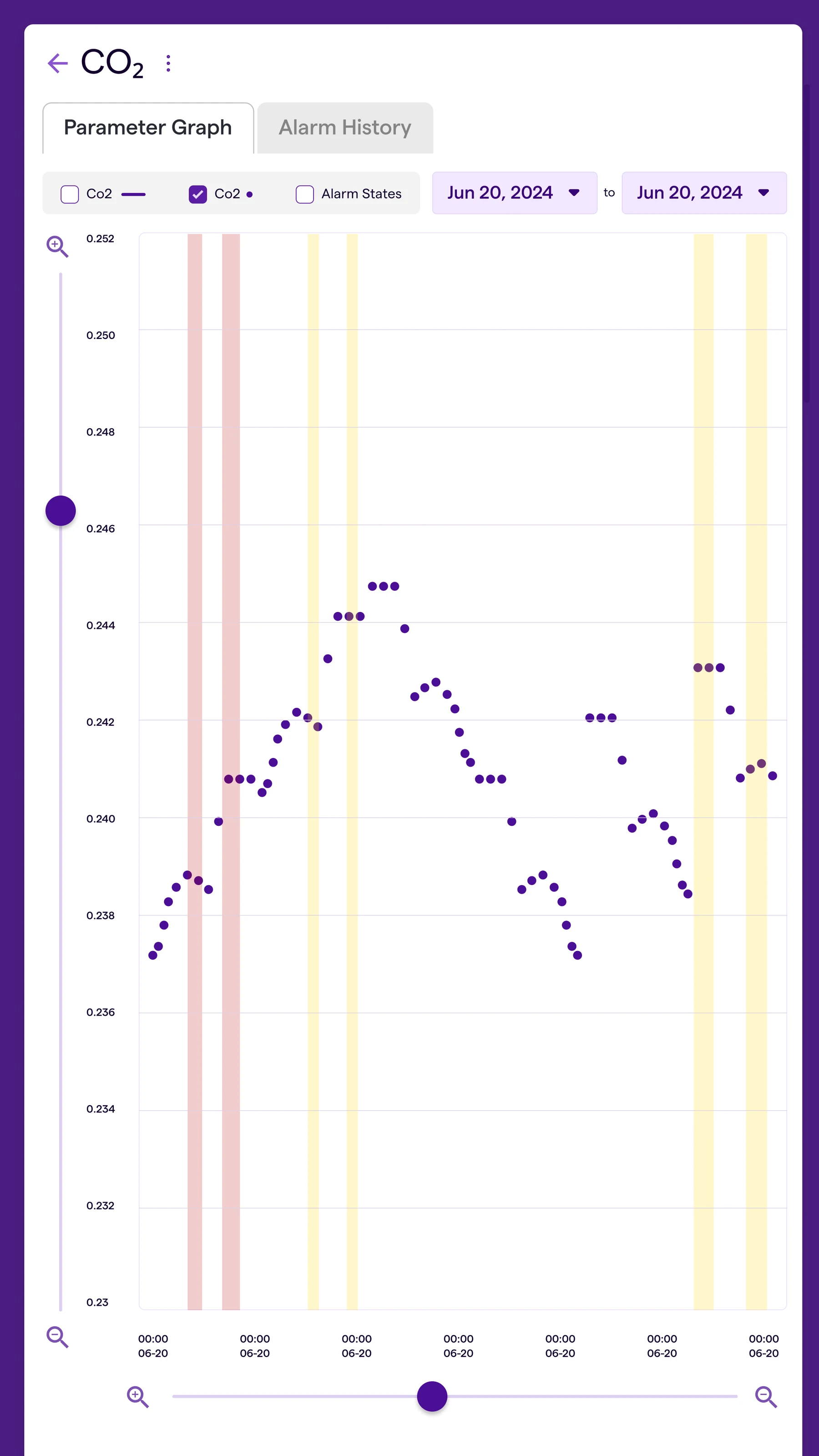
The redesigned UI has a clearer structure and tells the operator more plainly what the system is doing.
Standard patterns
- Standard layouts, spacing and component behaviour
- A clear difference between configuration, execution and monitoring
System state and feedback
- Clearer hierarchy for run status, progress and next actions
- Clearer alerts, warnings and confirmations
- Less doubt about what the operator did and how the system responded
Ecosystem alignment
- The same look and behaviour as the related desktop and cloud tools
I revised the designs through regular reviews to fit technical and regulatory realities.
Outcome
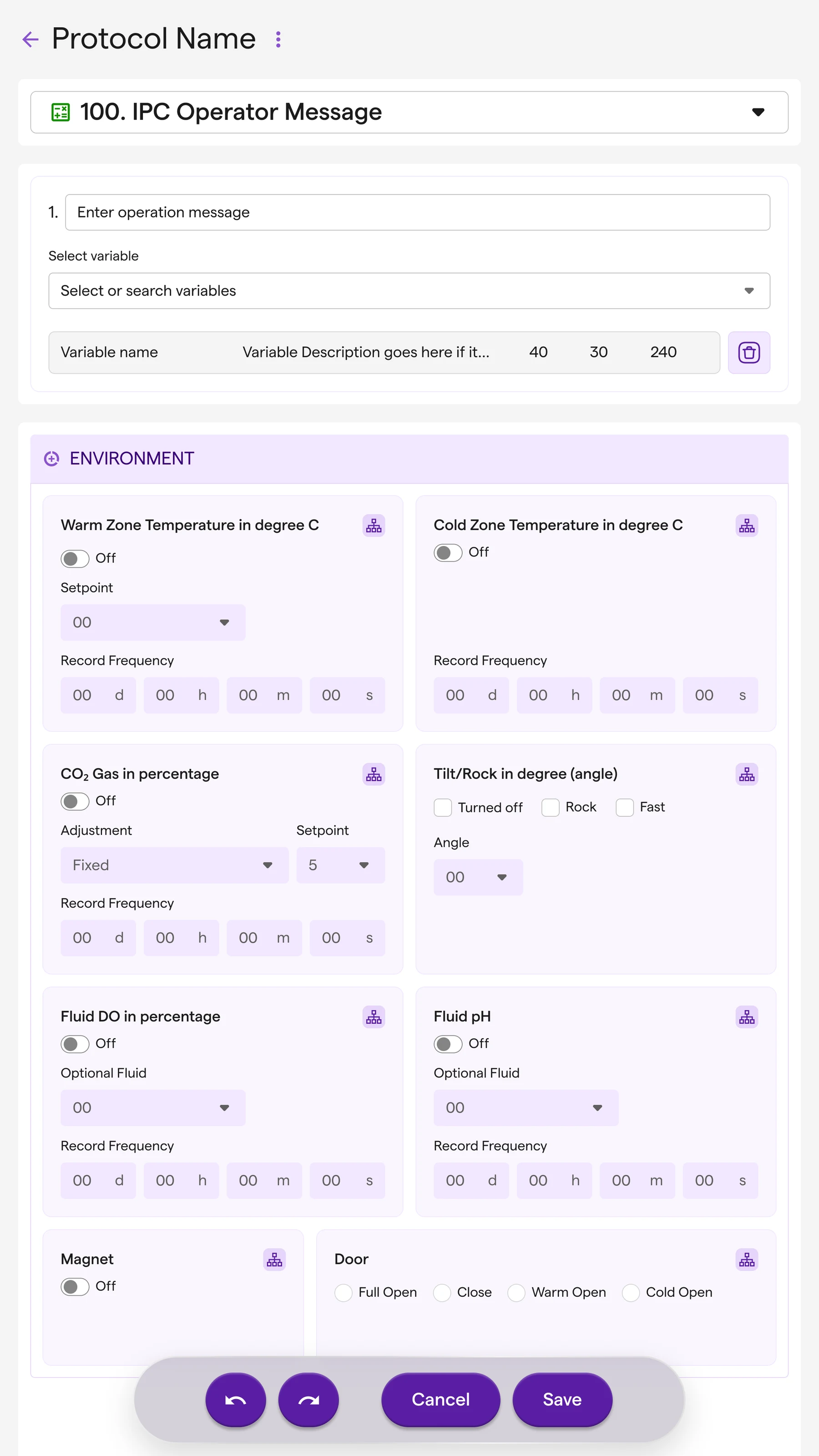
- One coherent UI across the product ecosystem
- Screens that are easier to read during a live run
- Clearer communication of system state and operator actions
- A UI foundation that can take new platforms and protocols
The redesigned interface left operators with less to interpret during critical steps.
Discuss this case study with you?
I'd be happy to walk through this project in more detail and discuss how this approach might apply to your needs.