Enterprise web filtering
- Role
- Senior Product Designer
- Duration
- 6 months
- Product
- Enterprise web filtering software
- Focus
- Research-driven UX strategy, enterprise workflows, UI modernization
Overview
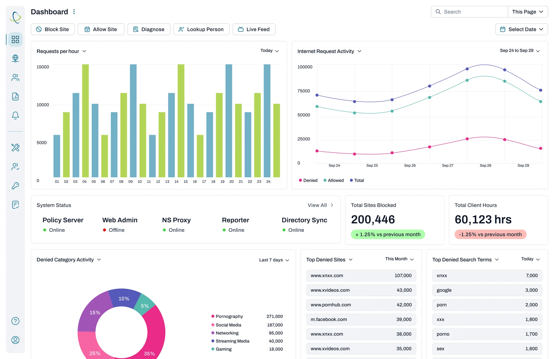
The client makes enterprise web filtering and internet safety software used by large organizations worldwide. At Strata, I spent six months assessing the enterprise platform, finding where it was hard to use, and setting a UX and UI direction based on what customers and internal teams told us.
The aim was to tie product direction to what customers actually needed and give leadership a concrete plan.
Problem
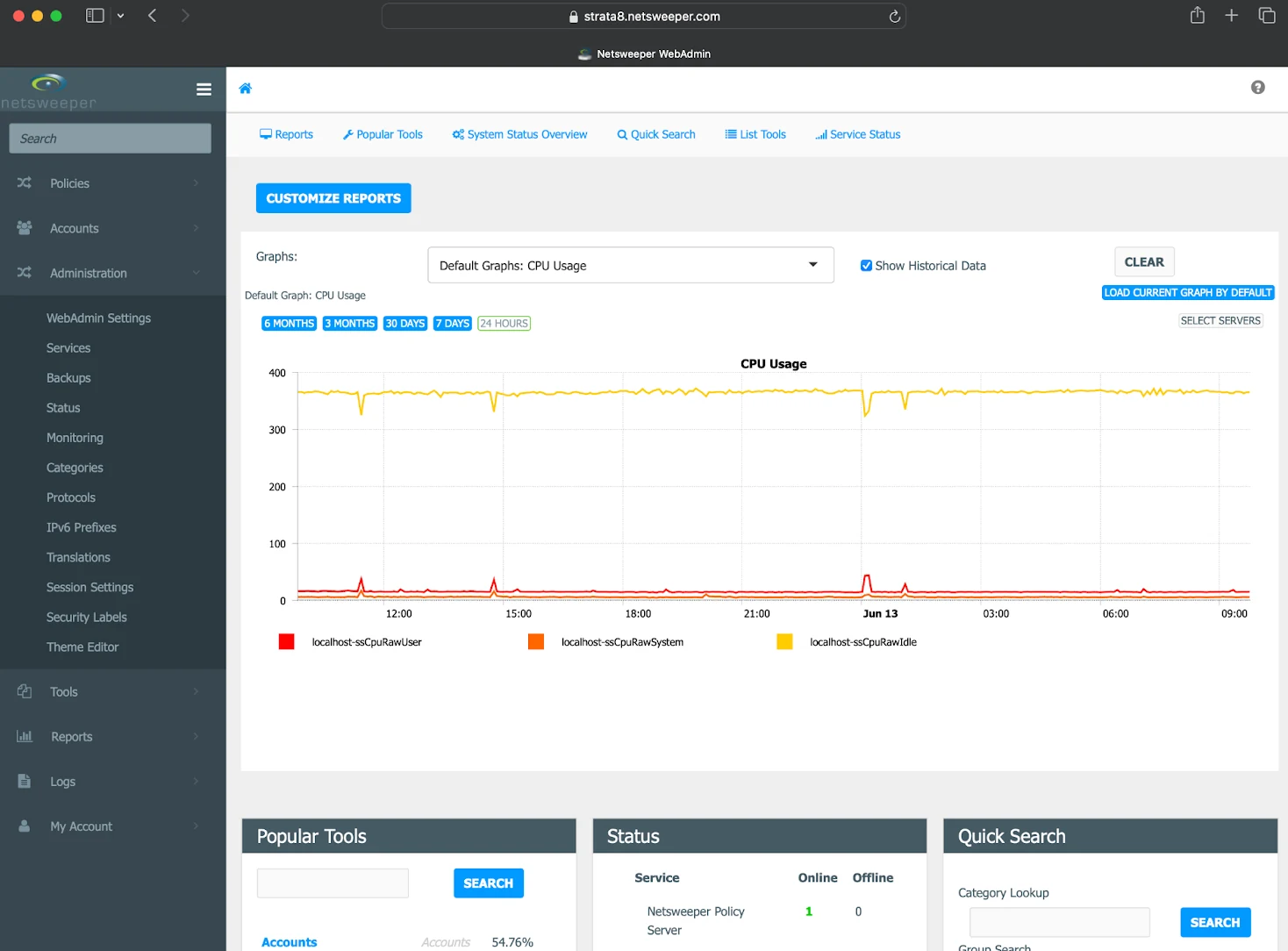
The platform had grown piece by piece over the years, and it showed:
- Workflows that administrators found hard to understand and manage
- Inconsistent UI patterns and old design decisions nobody had revisited
- A gap between how customers used the product and how it was designed
- No shared view inside the company of what users struggled with or what mattered most
Leadership wanted evidence before putting more money into development.
Research & discovery
Internal stakeholder interviews
I interviewed people across the company to understand their goals, constraints and assumptions:
- Sales
- Marketing
- Development
- QA
- Product leadership
The teams did not agree. They defined success differently and had competing priorities for different customer segments.
Customer research
I ran more than 20 in-depth interviews with enterprise customers to find out:
- How administrators actually configure and manage web filtering
- Which features they valued most
- Where they hit friction, confusion or workarounds
- What stopped them using the advanced features
The same problems came up again and again. Configuration was complex, it was hard to see what the system was doing, and people were not confident a policy change had worked.
Key decision
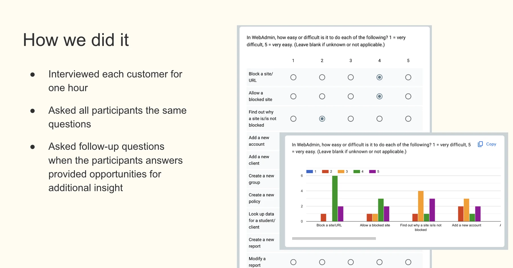
I asked every customer the same questions and had them rate the same tasks.
Each interview ran for an hour and followed one script, with follow-up questions where an answer opened something new. Because everyone rated the same tasks, I could compare answers across more than 20 customers and bring leadership patterns backed by quotes.
Synthesis & insights
The research came down to four themes:
- Overloaded screens that hid the most important actions
- Flows that assumed deep product knowledge
- Little feedback when a policy was applied or changed
- Too much to hold in your head during routine administration
I turned these into a prioritized list of UX opportunities, each tied to business impact and customer retention.
Executive readout & recommendations
I presented the findings to senior leadership. The presentation covered:
- The main research findings and the evidence behind them
- Customer quotes and the patterns across them
- UX risks to adoption and scale
- Recommended directions and near-term actions
It got leadership agreed on a direction and gave them the confidence to invest in design and development.
UX & interaction design
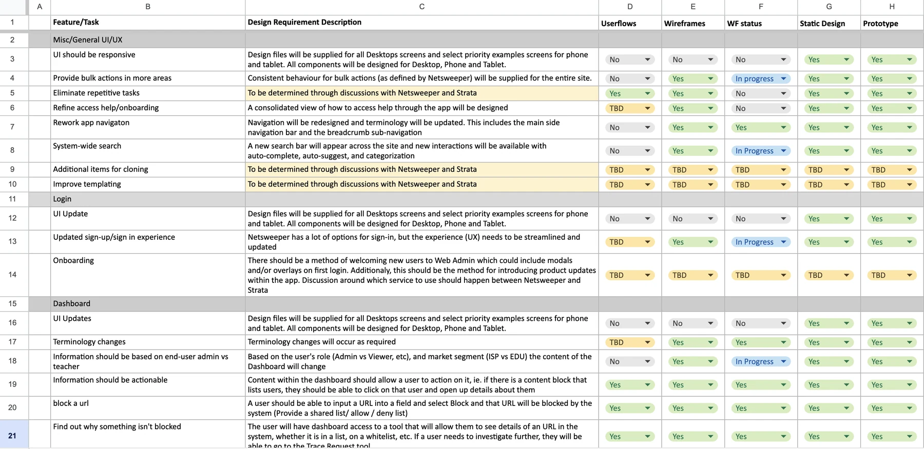
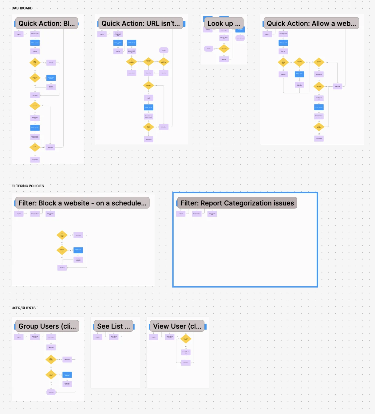
From the validated pain points, I produced:
- New user flows showing where the existing workflows broke down
- Shorter paths for common administration tasks
- A clear split between configuration, monitoring and reporting
- Less reliance on knowing how the system works underneath
These flows were the basis for the UI work and the prototypes.
UI direction & prototyping
I explored and delivered:
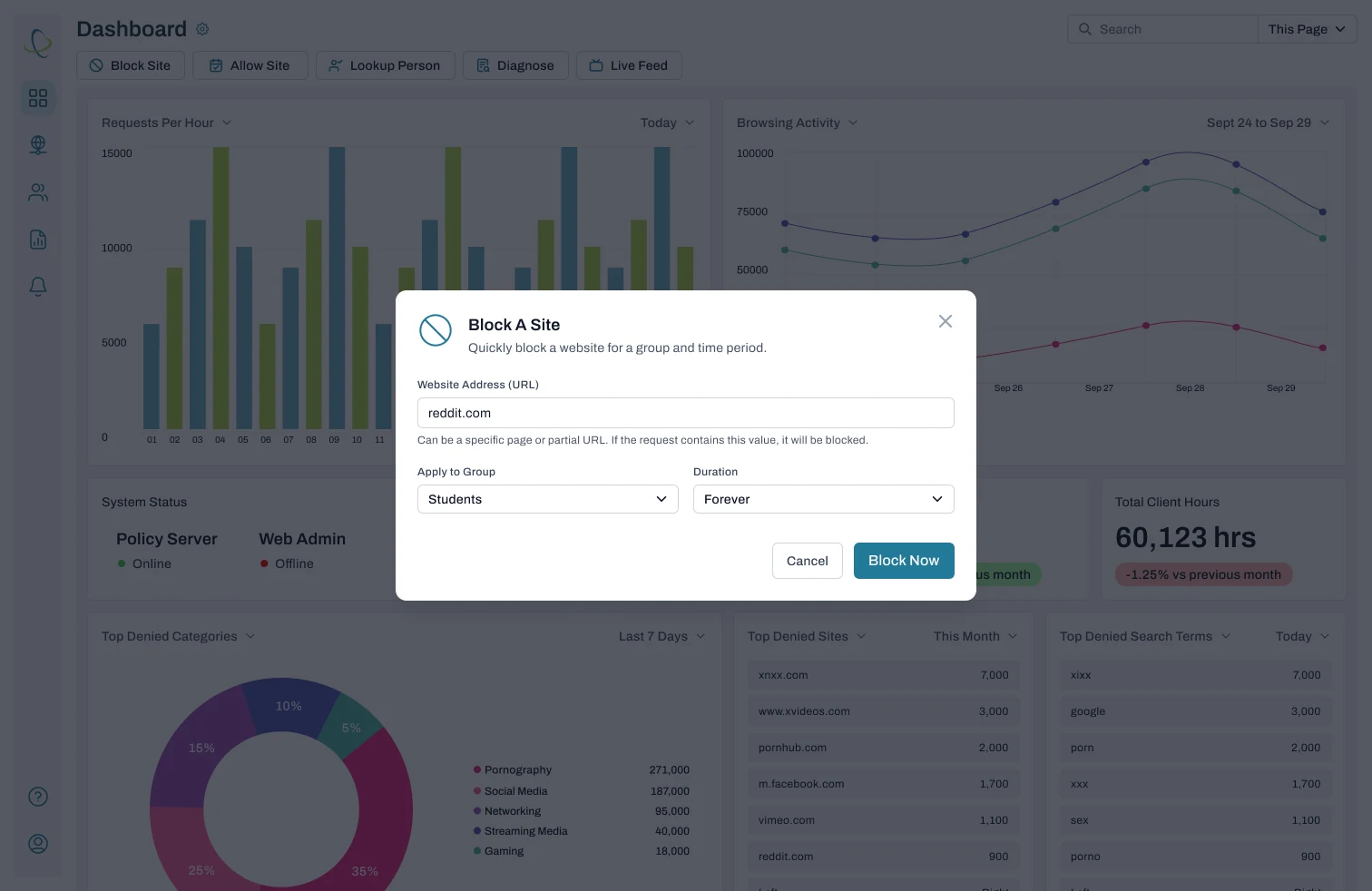
- Modern UI concepts suited to enterprise customers
- Clear hierarchy for dense data and controls
- The same interaction patterns across the platform
- High-fidelity prototypes of complete workflows
I presented the final designs to management and the development teams to support roadmap planning and implementation.
Outcome
- Leadership got a UX strategy backed by more than 20 customer interviews
- Teams across the company shared one view of customer pain points
- The enterprise platform has a defined UI and interaction direction
- Less doubt about where design and development effort should go
Discuss this case study with you?
I'd be happy to walk through this project in more detail and discuss how this approach might apply to your needs.